Technology 3: Electronic Medical Records and Informatics
Session: Technology 3: Electronic Medical Records and Informatics
 photo")
Anna E. Burns, BS (she/her/hers)
Research Assistant
Children's Mercy Hospitals and Clinics
Leawood, Kansas, United States
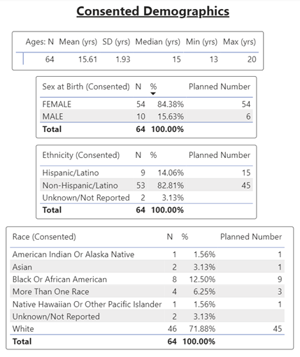 Consented participant demographics, generated by Power BI.
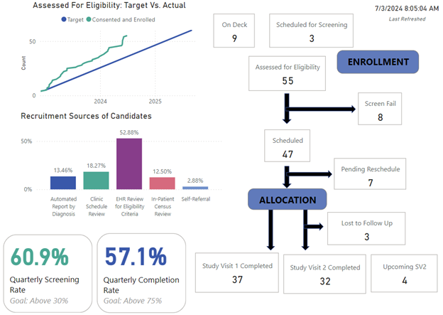 Simulated Power BI dashboard summary of various recruitment metrics. Quarterly screening and completion rates can be color coded based on goal value
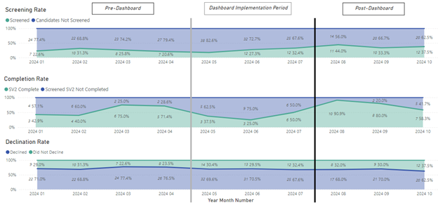 Power BI figures of rolling screening, completion, and declination rates, before implementation of visual dashboard (left of gray bar) and after 90 days (right of black bar). Note: figure has been abbreviated for clarity and starts in January 2024, while data collection began in October 2022.Consented participant demographics, generated by Power BI.Simulated Power BI dashboard summary of various recruitment metrics. Quarterly screening and completion rates can be color coded based on goal valuePower BI figures of rolling screening, completion, and declination rates, before implementation of visual dashboard (left of gray bar) and after 90 days (right of black bar). Note: figure has been abbreviated for clarity and starts in January 2024, while data collection began in October 2022.